Past january I decided to join a local game jam with a few friends. We were curious to see what we could do within the time limit of 48 hours, and were excited to make something together.
Inspired by the games ‘old man’s journey’ and ‘the final station’, I’d been wanting to do a do a side scrolling train driving game for a while, so we started thinking about how we could make a game like this that was simple enough to be made in 2 days, while also looking good and being fun to play.
^ Inspirations. Left: Old man's journey. Right: the Final station
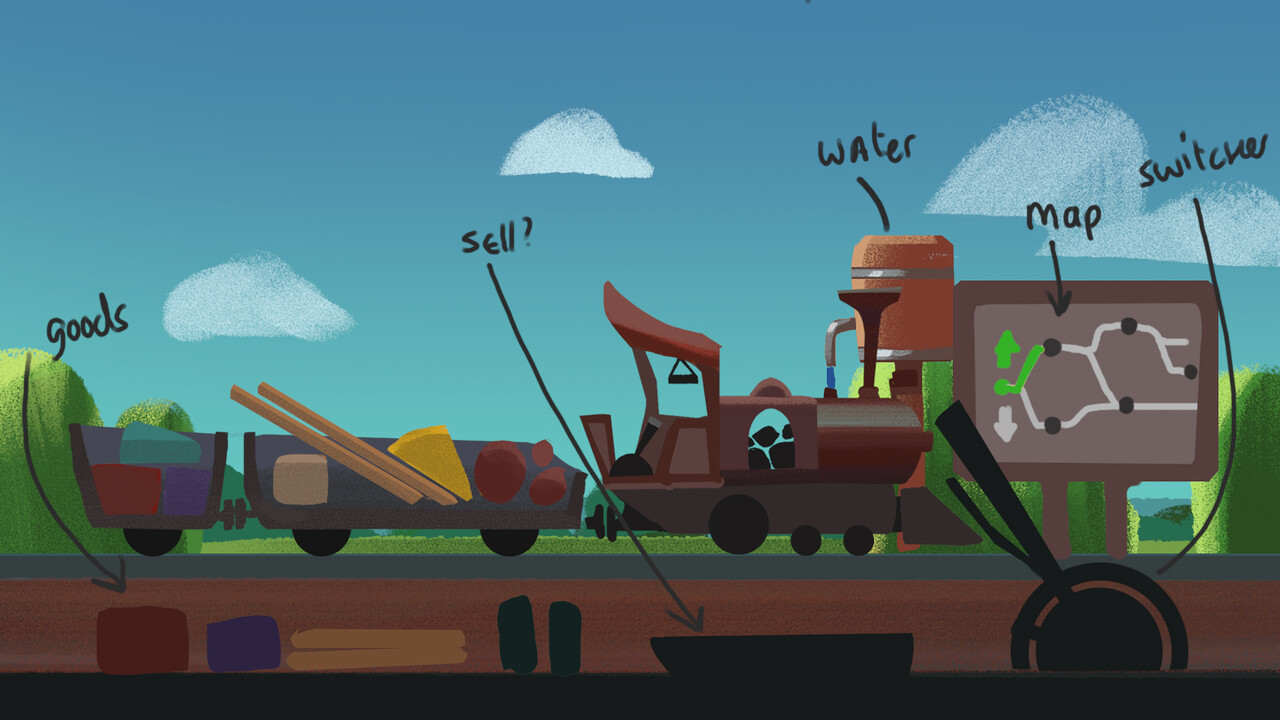
I set off to do some sketching and get the idea train going. We keep a Miro board with concepts and how we imagine we can structure it. Our idea is to have a game where you control a train. You drive it through different environments, buy and sell goods at stations and deal with obstacles on while driving.
With these two first exploratory concepts. I can already tell that we won't have time to make very detailed assets, so I choose to focus on using simple shapes, with a heavy emphasis on color dynamics to make it interesting and fun to look at. I lay out a workflow that both me and Natalia (my fellow artist) could use effectively to keep it consistent
So up next: what do we need for our game at minimum?
- A train
- Ways to control the train moving (Throttle, brake, whistle etc)
- Environments
- A train station to buy and sell goods
At this point I sketched and moved things around until we had some notion of what a good functional space could look like. We paid extra attention to where you would be clicking a lot, if the mouse movement made sense, if there was no overlap, and if the interactive areas were big enough to not get confused.
After drawing this out we get a good first idea of how we can partition the screen real estate and where what can go with it. Now it's time for one of the most important parts that we as artists have responsibility for; readability.
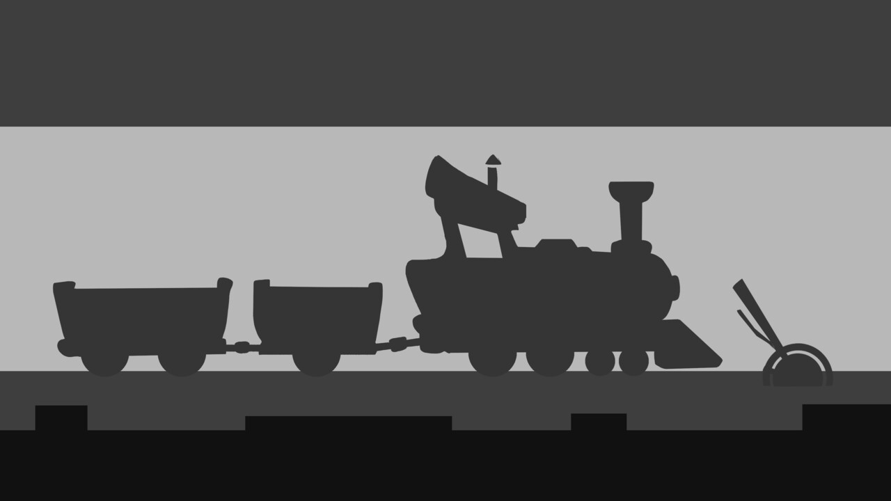
We want the most important parts of the game to have the most contrast. Since dark vs light values are the first thing your mind processes, this is first up. I set up a simple value hierarchy where the train is always the most important by using light backdrop to get a strong silhouette going. The secondary thing you should notice is would be whatever is around the train. In this case the foreground and environment itself.
The secondary way to approach contrast is by looking at color. I intentionally chose to make the train and foreground more neutral in color, This way the environment could contrast against it with its more saturated colors. Putting neutral colors against saturated colors is another way to create interesting dynamics while also keeping in mind where you want the player to look.
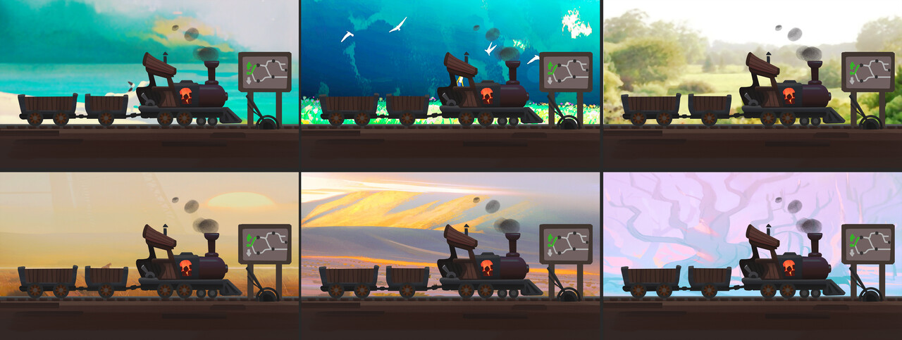
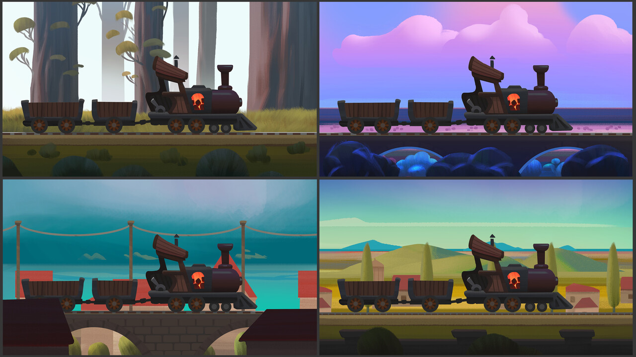
Now the fun starts! It's time to get exploring. I am now trying different color palettes by just putting random pictures behind the train to see what kind of dynamics could be interesting. I make sure they're always quite light in value and tweak them if they're not. I was very inspired by artist Elioli for these:
At this point the foundation is laid out, and it's producing time. During the process of making the actual game we do a lot of tweaking and puzzling things around, but all we do from here on out is supported by a structure that fundamentally works.
Hope this breakdown was of some interest. :)
The game can be played in your browser here
Coding and economy design: Job Talle
Art and design: Natalia Patkiewicz
Sound and music: Harm-Jan Wiechers


